
When we objectively look at a digital color image we get, as established in the first post in this series, an integration of the camera, the illumination, the image processing we used to process the different colors and the viewing device. In this post we will discuss the color balancing of an existing spectrum (illumination) and the white balance that will adjust it (the image processing) to our utmost satisfaction and desire to reach the perfectly color-balanced image. To make this a happy conclusion to our story this post will mostly be showing the different images to illustrate how everything fits together.
If you haven’t as yet read the previous posts in this series I strongly suggest you do since the image creation flow and examples will be based on results presented in the previous posts.
Getting the Best Image
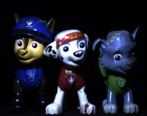
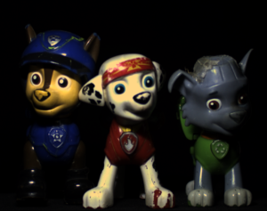
Let’s go back to Chase, Marshall and Rocky from Paw Patrol.
The collection optics used in this post are the same as in previous post: Allied-Vision-Technologies Alvium 1800 U-158 Color camera (Sony IMX-273 sensor integrated inside) with an OPT-C1618-5M lens. The AVT camera was provided by courtesy of OpteamX.
So, we have 3 pups, one camera, one imaging lens and we will use 3 different illumination sources: cold light, warm light and a setup where both illumination sources warm and cold together are projected to our target.
To remind you, the raw photos of these pups looked originally like this:
The following are the images of the illumination projected onto a white background:


I must admit that the illumination’s uniformity could have been better, however it gives the example a more realistic feel.
As a reminder, the spectral contents of the different illuminations (cold illumination and warm illumination separately – I kept the “cold and warm” illumination, which is a combination of both of these spectra, out of this post since the combined image was too hectic to decipher) are as follows:
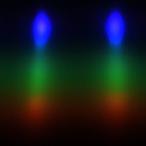
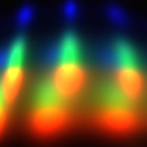
So, our image processing should compensate for the nearly complete lack of blue and purple in the warm light and for the unbalanced blue in the cold light.
When we use these white background images to calculate the correction to make them digitally “white” with the use of Grey-World white balance method we get the following images of the background:


As expected, we see that all three corrected images’ color is somewhat greyish. As expected I say, because that is mathematically what the calculation is doing – turning the grey levels of the “almost white” image as close as possible into an ideal white.
However, having the single color of white settled does not guarantee that the rest of the colors are as beautiful.
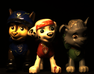
So, let’s look at our pups but this time with the colors balanced according to the white background.
Color Balancing Towards the Final Image

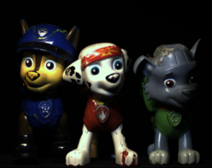
No matter on what device you chose to view this post, clearly not all three images came out in the desired quality we wanted them to. In our particular case the combination, where the illumination included both the white and cold light sources, gave originally the best result and which gave the best starting point to enhance the image to the best looking image. The correction of the warm light on the other hand, started highly unbalanced and ended unbalanced after the correction as well, unlike the cold light image which came out with a reasonable color balance. It means that the lack of blue in the warm light spectral content had much more weight than the unbalanced blue in the cold light spectral content.
Why did that happen? If we take a closer look at the corrected white background images you may notice that the cold illumination and the cold and warm illumination are more alike while the warm illumination image seems more greyish than the other two. It gives us a hint of what’s to come. The black will always stay black one way or another however, in the warm illumination image the best “white” will appear as grey. It also means that all the other colors in between will appear shifted or artificial. On the other hand, the cold illumination’s red colors were there inside the image, they just had to be enhanced as opposed to inserted into the image from thin air.
To sum up we achieved one nicely colored image but with slight artificial color tinting, one dark and very artificial-looking image and one image with the vivid colors – the kind we wanted to end up with. Eventually if it were during system design and we had to choose, we would have chosen the combined warm and cold illumination.
There is a morale to this story. There is a limit as to how vivid the colors in an image could be turned into if the original image was taken with inadequate optical parameters and conditions. Eventually, when we want to have vivid colors the illumination content must include the visible light range.
The best practical example I may give in this context is underwater photography where at the depth of 3 meters the red color is completely missing from the ambient and at 10 meters already the whole spectrum from red to yellow is missing. In these cases, no matter what kind of image processing you employ, the red and orange colors will always look artificial. BTW, that is why underwater photographers carry big and powerful strobes with them which look like mini-submarines ![]() .
.
Obviously, we could have used a different color balancing method on our Paw Patrol pups but the end result would not change much. To be frank, when preparing the images for this post I also tried direct color matrix correction and other kinds of white balancing but all the images came out much more artificial-looking than the ones presented here, so I kept the standard white-balancing method for the presented images.
Finally, to emphasize the transformation from where we had started, the final images after applying the white-balance correction are presented on the right column side-by-side with the original images in the left column.
That’s where we finish our story with our color images of Chase, Marshall and Rocky, in which we covered over 4 posts how we started from a simple optical setup via light contents analysis and simple image processing principles to a color image presented on our screen. There are a lot more topics to cover in color imaging and color perception that will be covered in other future posts in these wonders of colors post series.