In the old days, when one of your light bulbs at home got burnt out, you would go to the store and ask for a light bulb, paid the bill and gone happily home to replace the old bulb. Nowadays buying a light bulb has become a bit more complicated. There are so many types of light out there and each with a different “light” or “white” title: soft white, daylight, bright white, warm white, LED light and so on. The one thing they all have in common, one way or another, is that they are all white light. So, what is the difference? And why should we care about it when we build our system?
So, in this post we will review what the spectral content of light is and how to measure it and most importantly how to compensate for it in a color image.
Light Spectral Content
Not all illumination sources were created equal. Each illumination source has its unique spectral curve and this is especially so where white light is concerned. It means our spectral expectations from a LED lamp or a fluorescent lamp or a filament incandescent light bulb should not be the same. This is illustrated clearly in the 4 different spectra of white light below:
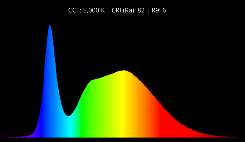
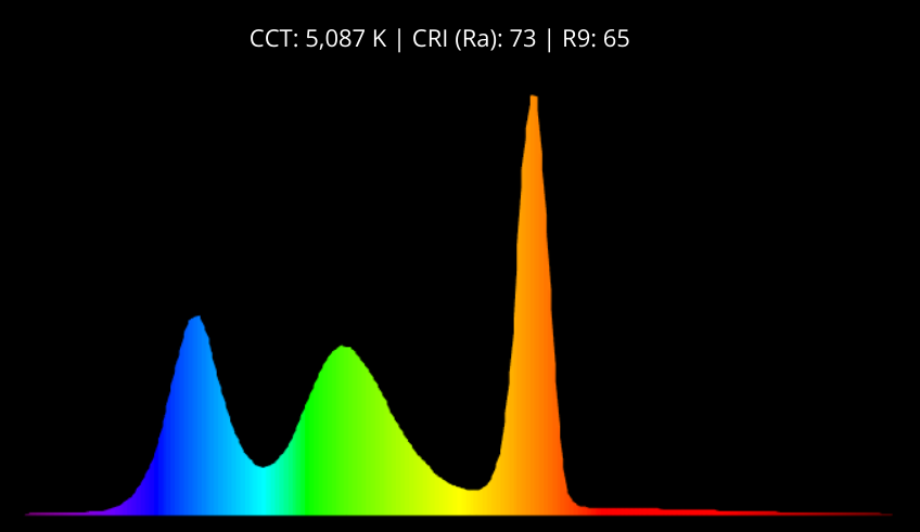
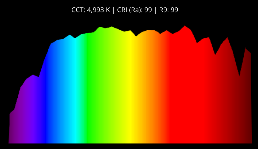
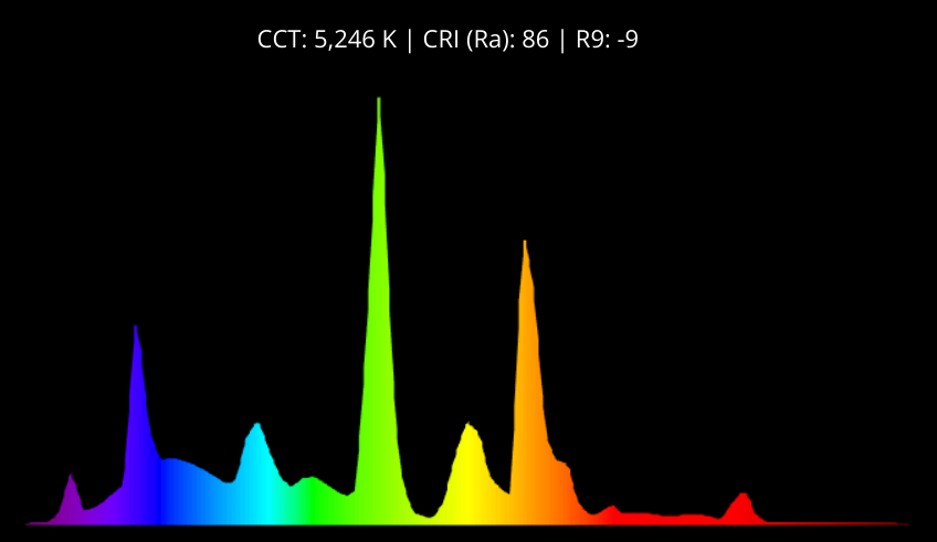
The different spectra were taken from Waveform Lighting website.
As we can see, even though all illumination sources are “white” and even with, more or less, the same correlated temperature (see below) their spectral contents are very different.
Note also that there are a lot of methods to quantify our light content among which is the Color Rendering Index (CRI) Color Correlated Temperature (CCT) which is the measurement system in the spectra demonstrated above. Without going into too much detail, the light temperature is the content of the light compared to a black-body radiation with the same temperature. A “warm” light is rich in the red and yellow colors and confusingly enough has a lower color temperature of 1800-3500K, while the “cold” light which is rich in the blue color has a higher temperature of 6500K and above. Sunlight for reference purposes is around 5700K. Read more about it here.
However, as you see in the different sources, the spectral distribution is not equal which is the main reason to include also the CRI. (BTW, the R9 in the spectra above stands for the content of vivid red in the spectrum – one aspect of illumination the Waveform Lighting mark as their products’ goal, which is the main reason they bother to mention it separately in their specs).
Engineer Your Illumination Spectral Contents
Engineering the VIS spectral contents of your illumination really depends on your application as follows:
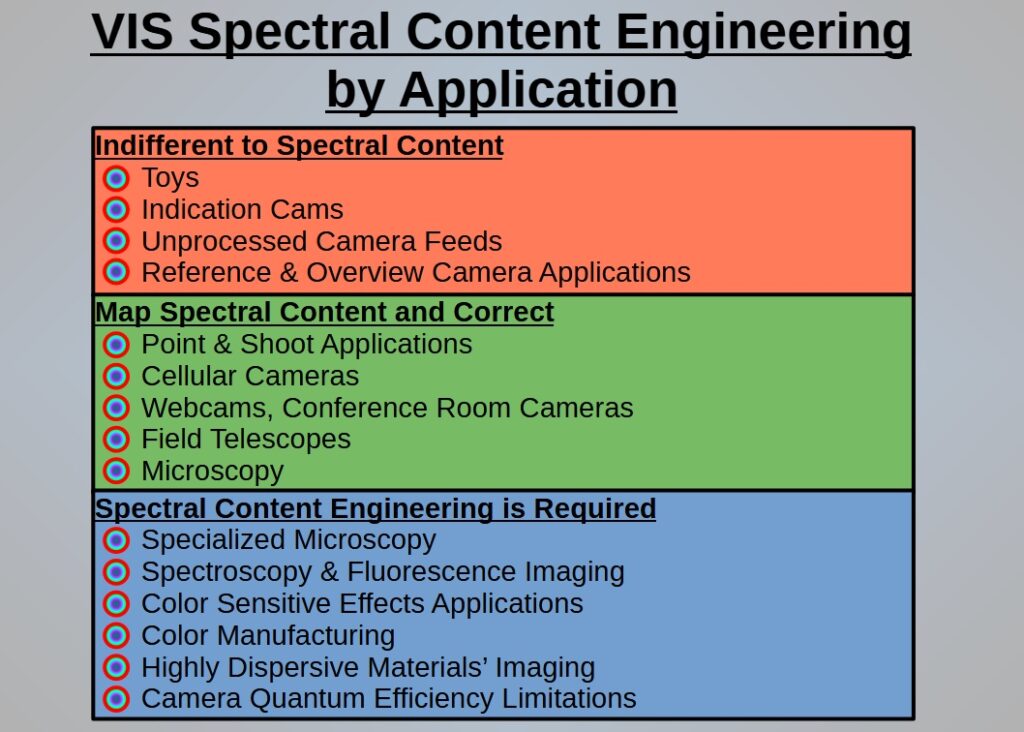
Indifferent to Spectral Contents
There are applications that you are completely indifferent to the spectral contents or where it is sufficient to know only your illumination’s spectral contents and no more such as with toys, indication cameras, unprocessed camera feed and reference and overview camera applications where the camera is integrated in the application only for the user to have a color image because, well, he\she is human.
Map the Spectral Contents and Correct it via Image Processing
There are the applications where you need to know and compensate for the illumination’s spectral non-uniformity in VIS such that the white will look like real white when you project the image on the screen, for example with point & shoot cameras, cellular cams, webcams & conference room applications and field telescopes where you would want to have the closest image to what the user has seen with his very own eyes; microscopy also falls into this category when we look at the image in white light.
In general, these are the application where the image should look good to the human eye, but it does not get processed to high accuracy levels of colors.
Spectral Contents Engineering
There are those applications where you should have your illumination engineered specifically to a required color distribution because these apps outcome or their image processing is very sensitive to the subtle changes in color. This list is quite diverse and includes: specialized microscopy, spectroscopy & fluorescence applications and color sensitive effects application (for example, diamond colors detection and mapping) where the different colors have different scientific or applicative meaning; Color manufacturing where if the plastic has a different shade of blue may turn it out of spec for the customer; Highly dispersive materials’ imaging where we have to control each and every wavelength coming into our system; Camera QE limitations for example the QE curves we mentioned in this post where the far red QE drops below 40% which may be insufficient and so on.
The Concept of White Balance
After establishing that the spectral content is different for each illumination source and different whites exist the next step goes into the image processing. When it comes to projecting color on the screen, the whitest we could go in RGB format is all-channels-max i.e. {Red=255, Green=255, Blue=255} in a 24bit color image (for the ease of this explanation I am going to stick with the 24bit example).
So, in terms of image processing, if we have a reference image which we measured the “white” of our system or we have an image in which we force some of it to be white, we only have to stretch that value into all-channels-max. The processing of balancing the white to match the real physical spectral contents of the illumination is called white balance.
Balancing only the white is easy however having the image preserve the all other colors in the same processing is a bit more challenging.
For that reason, over the years, many white balancing algorithms and methods have been created, each with its strengths and weaknesses.
White Balance Algorithms
- Algorithms that make an assumption regarding the image statistics such as Grey-World (which assumes that the average color in each scene is neutral grey), White Patch Retinex (which assumes that the brightest pixel in a scene is white) and so on. Because these algorithms are based on a single image scene calculation they can be applied as Auto-white-balancing algorithms. If you would like to delve deeper a very good reference article to start with can be found here.
- Machine learning. We know a cucumber is green, with the different shading of it. Applying AI to fix the colors has become more and more common in special applications.
- Prior knowledge algorithms, when we know for a fact, as part of our system that the image has a certain pixel group with certain color then adjust the whole image accordingly. These algos are mainly used in closed environments, labs and manufacturing for example, that may “sacrifice” some of their image for the sake of color accuracy.
- Calculation of stretching coefficients according to reference images with target colors, for example color checker cards, grey card and white checker card. Once in a while there is a calibration process that has to be done with the reference cards so as to keep the system calibrated in the cases of illumination changes or deterioration. This is, obviously, a safer way because it does not make any assumptions or statistical analysis for the purpose of the color correction.
- Manual balancing. Professional photographers and creatives know exactly what kind of vivid colors they would like to get out of the image and usually know how to play with the different color balancing to reach their goal. This is obviously an art and totally depends on the person doing it. No rules here.
It is important to remember to choose the best fit balancing algo to your application and not run to the first common implementation found.
As always, this is only the tip of the iceberg. We could go on and on about the different illumination types and their spectral content and which balancing algo to use in each specific case. We may get back to this particular topic in later posts.
White Spectrum in Real Images
All this is well and good but how do the different spectra manifest themselves in an image?
Let’s take a look at three different LED lighting projected on a white A4 paper:
Image #1

Image #2

Image #3

As in previous posts, the images were taken with the Allied-Vision-Technologies Alvium 1800 U-158 Color camera with an OPT-C1618-5M imaging lens. The AVT camera was provided by courtesy of OpteamX.
These 3 images may be a bit misleading: to the naked eye the paper looks white, maybe brighter or darker but white, but when taking these images with a color camera they become more color specific. It happens mainly because you have the whitest white on your screen right next to the images so you clearly see the color tendency.
- Image #1 – White A4 paper raw image taken with flash light illumination
- Image #2 – White A4 paper raw image taken with cold light illumination
- Image #3 – White A4 paper raw image taken with warm light illumination
It is a bit difficult to see exactly what is the exact spectral content of each image so we will use our spectrometer-like setup from this post, to spread out the spectrum for each illumination source (left to right from #1 to #3):
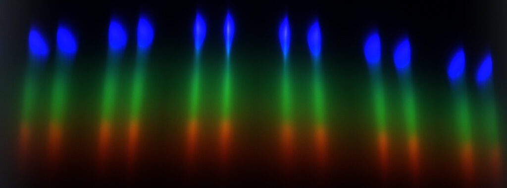
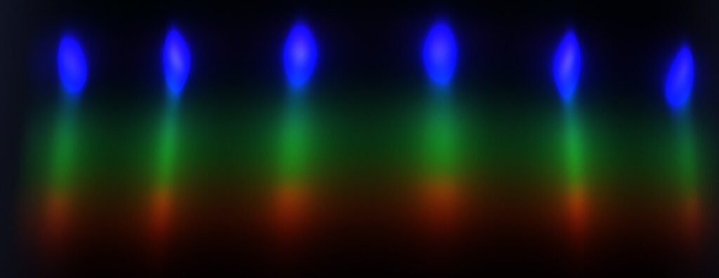
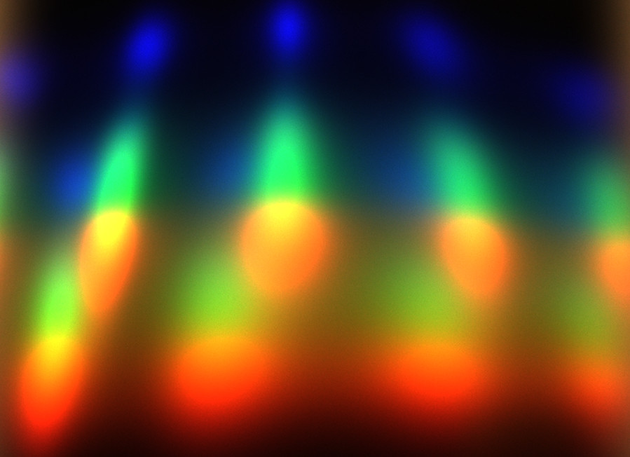
Image #1 clearly has a relatively high content of blue but most of the colors are quite leveled; image #2 has a very strong blue compared to very low contents of red and relatively low contents of yellows and greens; image #3 has a very high content of red and orange, reasonable green however very low on blue (BTW, you may see there are 2 rows of LEDs in that particular LED strip).
However, let’s take a look at the following images, where I used Grey-World algo to auto-fix these whites:
Grey-World White Balance Images
Image #1 White-Balanced

Image #2 White-Balanced

Image #3 White-Balanced

These are definitely closer to white towards grey as opposed to clear blue or yellow color. This implies that we could choose whatever target color we wanted to represent our “white” color and apply it to the image. BTW, it is interesting to see how our eye translates different shades of grey as still being inside the definition of “white”. Note also that applying a non-fit white balance would make the image’s colors deviate from the real color distribution of the image. I am not even going to bother showing an example of it here, it is just simply applying wrong parameters in a mathematical function.
Note also that I did not point out which illumination is better, simply because good or bad is defined by the requirements from the illumination and imaging system were. When the requirements are satisfied the apparent looks of the raw image is of no importance.
That’s it for now. In this post we saw that different light sources have different spectral content that with the correct image processing we could compensate and equalize different spectral contents to appear the same in a standard color image. In the next post we will see how in practice things may look like in real images when we image real objects and not just the a white piece of paper.