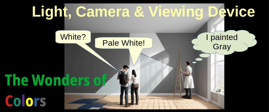
Towards the end of the 20th century we were introduced to color digital cameras that embraced the 3 color technique that had been conceived long before. The world of colors in visible light optics and digital cameras is fascinating which involves a lot of interesting phenomena. In this post series I will review in each post different aspects of color optics, acquisition and image processing, starting with how the final color image we perceive is a function of the light, camera and viewing device in our optics, all brought together with image processing. This is the first post in this series.
When my wife and I had to decide on what color our walls would be painted, she insisted that it shall be a “cream color”. In all honesty, until that particular moment, I did not know that cream was a color ![]() . I naturally wanted the walls to be painted white but my wife reassured me that I would not be able to tell the difference which of course she was right. Now if you ask me our walls are white and moreover in the evenings our living room walls are not even cream-colored but a shade of yellow.
. I naturally wanted the walls to be painted white but my wife reassured me that I would not be able to tell the difference which of course she was right. Now if you ask me our walls are white and moreover in the evenings our living room walls are not even cream-colored but a shade of yellow.
See examples below


and side-by-side

Word of caution: in this post series there will be some subtleties in color differentiation that will appear differently on different screens, be it Smartphone vs. PC screen vs. Tablet and one PC screen vs. another. If there are such phenomena, those that are not seen clearly on your screen I will point out and suggest changing the brightness and color settings on your device or switching to another device.
Illumination and Image Processing
Back to digital color cameras. As already mentioned in a previous post, the choice to use color camera strongly depends on what our application is and what method we use for data analysis with this camera. One of the main issues we may encounter when dealing with color cameras is the constant need to calibrate its color to our required accuracy.
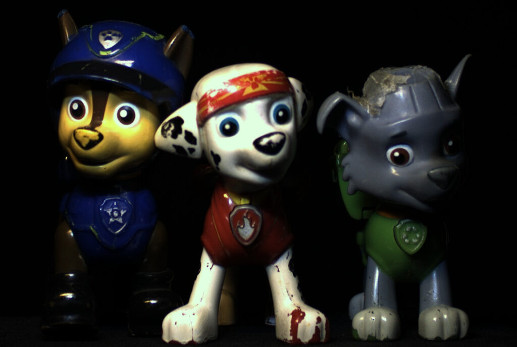
For example, the following color image of Chase, Marshall and Rocky from Paw Patrol taken with an RGB LED light:
Image #1
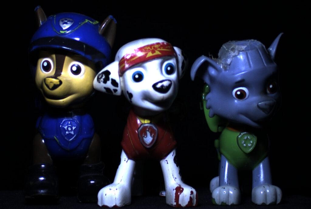
Chase, the blue one if you are not familiar with these pups, is supposed to look, well, blue. But does he? Marshall is supposed to look red-and-white or reddish-and-cream but does he?
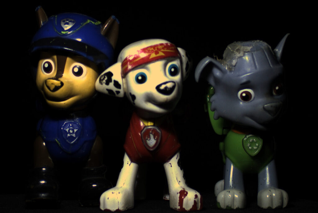
How about now?
Image #2
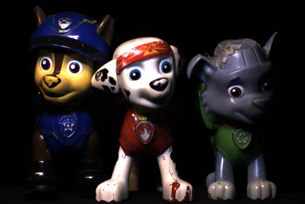
And now?
Image #3
And image #4
Our targets, Chase, Marshall and Rocky, were not changed between these two images. To make things even simpler the collection optics i.e. the camera and the collection lens were not changed. I used the Allied-Vision-Technologies Alvium 1800 U-158 Color camera (Sony IMX-273 sensor integrated inside) with an OPT-C1618-5M lens. The AVT camera was provided by courtesy of OpteamX.
The changes table is as follows:
- image #1 – raw image with cold light
- image #2 – cold light image, processed with Grey-World White Balance
- image #3 – raw image with both warm and cold light
- image #4 – warm and cold light image, processed with Grey-World White Balance
So, in practice, the first two images of our lovely trio are based on the same image, the second image is simply the first one with a different ratio between the red, green and blue levels. The same goes for the third and fourth images – the third is the raw image and the fourth is the processed image, to be specific, different white balance, a concept we will go into in detail in one of the upcoming posts.
Camera and Projection Device
And now, another point of interest: I uploaded image #3 to a cell-phone and took a photo of the cell-phone and my PC screen together with the same camera (this time a Samsung cell-phone camera) with auto-WB deployed, as follows:
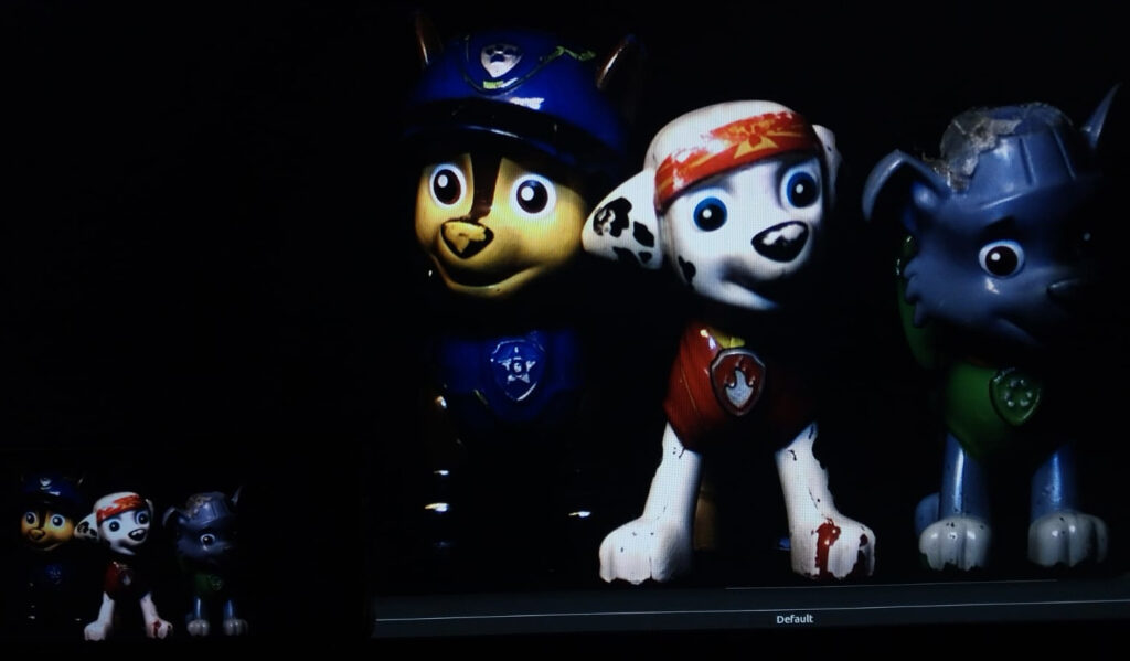
With the cell-phone image on the bottom left of the image, while the pc screen is the big image in the center-right. When you zoom in a bit you may see that the cell phone image has different colors, for example the red band on Marshall’s head – it is fuller red color (137GL Red) on the cell-phone than the PC screen (117GL Red) while on the other hand, the PC screen’s white is “whiter” than the cell-phone’s – yes, yes, the cell-phone is “cream” ![]() .
.
To make things even more confusing, let’s look at the same two projection devices taken with another cell-phone camera (Xiaomi this time):
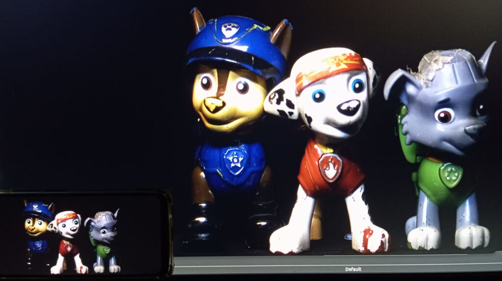
In this particular camera we see that the blue in Chase’s helmet is more vivid than the Samsung camera. The image is however a bit brighter and we can see that the white of both images screens is a bit more balanced compared to that of the Samsung cell-phone.
As usual, I did not mention which is better – there is no such thing. Better is a matter of requirement and we’re here only to show that there is a difference between the different screens and between the different cameras.
To sum up, we have established that our objective digital perception of color in an image depends on 4 things: the camera, the illumination, the viewing device and the image processing that combines them – which turns out to be very challenging indeed in maintaining objective perception. To further shake things up, if we add some subjectivity then every individual’s eye sight also adds variability to that perception.
This post’s objective was to show by examples the basic factors that impact our digital image.
In the upcoming posts we will see how we deal with these issues to make the color measurement of the camera as repeatable, accurate and reliable as possible to match our requirements.

